2022-Very-Peri

Pantone’s new Color of the year has a courageous presence that encourages personal inventiveness and creativity.

Color masters Pantone recently has announced Veri Peri as their Color of the Year 2022. The ‘periwinkle blue hue’ with vivid red undertones has since become the most talked-about shade of the season.

PANTONE 17-3938 Very Peri

“We first did color of the year to get people talking about (the role of) color,” she said. “And once you get them talking about it, you then create a buzz and the realization hits them: color is such an integral part of our everyday lives, but we take it for granted.”

-Pantone Color Institute’s Executive Director Leatrice Eiseman

Tagged with: , , , , ,

Design Podcasts

I love ideas and soak them up like some people take baths.

Ideas come from everywhere and anywhere. One of my most relaxing sources for inspiration is listening to podcasts. Great design is delightful and magical and most of the time invisible.

logo

One of the most brilliant podcasts I listen to each week is a “tiny radio show about design with Roman Mars”–99% Invisible

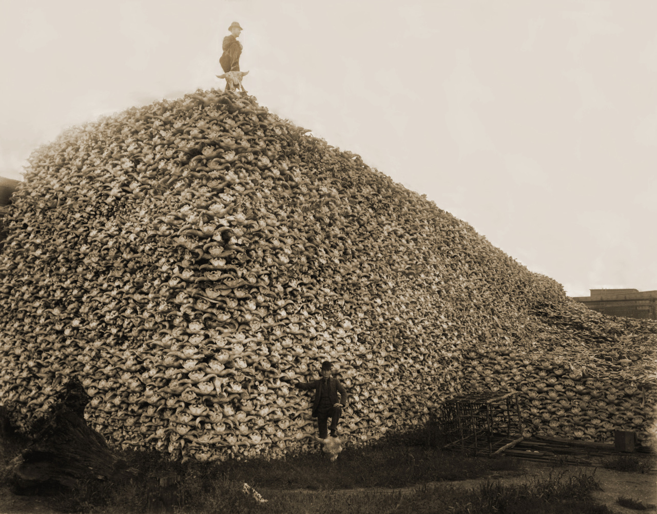
Days after my post about a book I self-published, about the pioneer days of Canada’s western frontier, Roman put out episode 157: Devils Rope. In the article notes he used one of the same images in “The House Belongs To The Government“. Gotta a love the serendipity of that!

In the mid 1800s, not many (non-native) Americans had ever been west of the Mississippi. When Frederick Law Olmstead visited the west in the 1850s, he remarked that the plains looked like a sea of grasses that moved  “in swells after a great storm.” Massive herds of buffalo wandered the plains. Cowboys shepherded cattle across long stretches of no man’s land. It was truly the wild and unmanaged west, but it was all about to change, due, in large part, to one very simple invention that would come to be known as “the devil’s rope.”

Episode 157: Devil’s Rope

The story is about how a problem was solved by brilliant design and changed the face of an entire continent in the process. The simple design solution even helped spread the invention of the telegraph and telephone! There turned out to be sinister uses too, as so often happens with profound technological change.

Tagged with: , ,

Language of Color

Color of the Year Marsala

Where color is concerned, everyone has a strong opinion. “Baby Puke Green! You painted the showroom puke green!”, the red faced company president yelled out at me. And he was smiling, because the design community was loving it. The NeoCon product launch was a hit!

Color is risky business

Because color is so subjective, it can easily lead to difficult remarks like the one above. There are safe colors embedded in the brand if it is well established. What do you do when it’s a new campaign or a new brand? There are few safe places to hide. You have to choose the right colors; build a palette of shades that communicate the message. One of the easiest elements to understand in the language of color is the PANTONE Color System.  Their forecast colors add even more depth to your objective color choices. These forecasts help provide timely inspiration and emotional language that help you define your choices when you run into a subjective argument. Command of color theory is essential to the language of color but nothing is as much fun as the announcement of the coming year’s forecast colors.

PANTONE Color Institute recently announced Marsala as Color of the Year for 2015

PANTONE’s Spring and Fall color collections are a great way to tune design with the marketplace. Once you get familiar with them its hard to walk down the street without seeing their power everywhere. As a producer and creator, the challenge of realizing great ideas and superb execution, usually collides with deadlines. PANTONE is a fast track to color success and color objectivity. (This may post sound like an ad but is simply how I work and this tool is actually indispensable in my work as a creative director, photographer and developer.)

PANTONE Colors of Spring 2015

MarsalaAqua MarineScuba BlueLucite GreenClassic Blue

Toasted AlmondStrawberry IceTangarineCustardGlacier Grey


These yearly, Spring and Fall, collections top my favorite tools list. Every design project has a list of problems that can affect your momentum. What font, images, colors, concept will bring the message power and longevity? If you can quickly resolve a color palette for your project, then the ideas tend to flow.

A decades worth of PANTONE Colors of the year

201520142013201220112010

20092008200720062005
Color is inspiring and controversial. Color selection can be the difference between success and failure. With a confident color palette in hand, many of the subsequent choices become much easier to execute.


Color is something everyone responds to. Color speaks volumes but color’s appeal changes over time and season. Brand colors are easy, campaign colors are harder. Solving the color problems can be a bit like a school yard argument. I’m sure you know exactly what I mean. It’s great to have PANTONE at your side to help settle the situation.

Tagged with: , , , , ,

House Belongs To The Government-Book Publishing

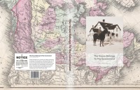
Cover HBTTG

Designing and self publishing a book

Its funny how things turn out. I am first and foremost a photographer, a career which developed my sense of composition, design and story. As life carried me along, I found myself increasingly specifying design and managing communication projects. I had evolved/morphed into a Creative Director! Recently, I self-published a 460 page book that started out with no photography as all. Book publishing is demanding in many ways but new technologies are making it easier than ever before.

My father, an anthropologist, passed away, never finishing his epic family story. Asquith Press, part of the Toronto Reference Library’s Digital Innovation Hub helped me complete this very personal journey.


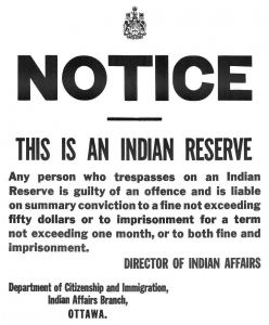
notice_IR

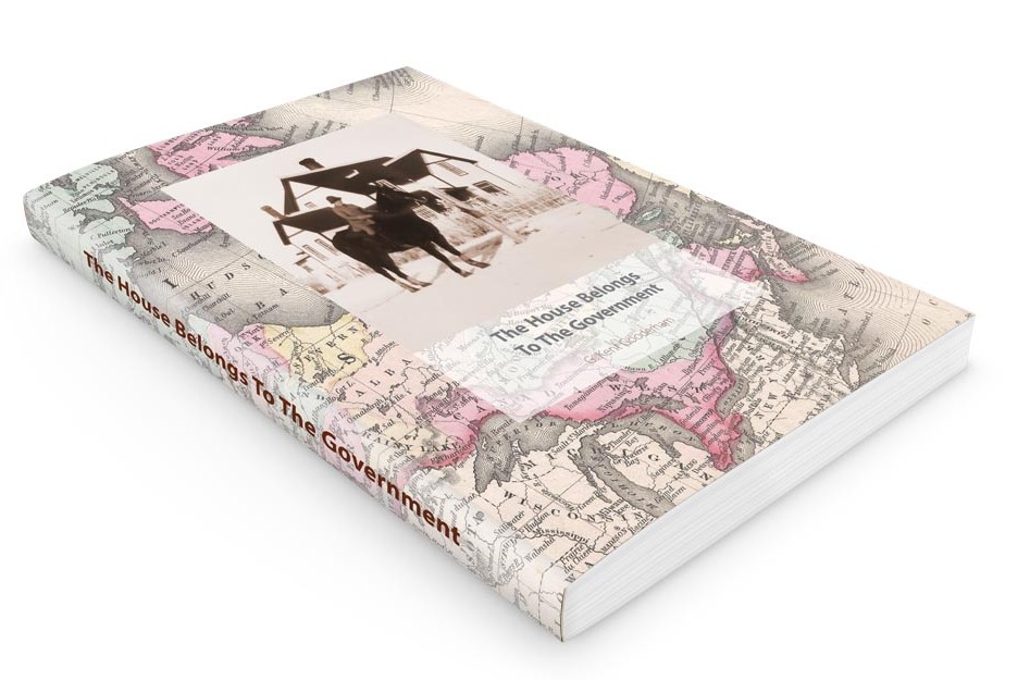
The House Belongs To The Government
G. Kent Gooderham

Ezekiel Gooderham was a brother of William Gooderham, co-founder of the Gooderham and Worts Distillery at York in 1832. This is his family story as retold through prose and verse. Ezekiel’s family continued westward as Canada grew, assisting the Cree and Blackfoot cope with life on reserve. Three generations of Gooderhams share their stories and reveal a personal portal into life on the Canadian prairie from 1879 through 1960.

The Book Machine.

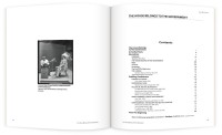
The book design started out with no images whatsoever–460 pages of text! Designing a corporate brochure offers lots of visual elements that are fun to work with. This project would be an unexpectedly challenging project. Of course I understood the mechanics of offset printing and preparing creative for that process however the simplicity of “the book machine” (as Coach House poet bpNicol referred to the design problem), is surprisingly difficult to do well.

Typography would be an vital element. The history/genealogy laced prose also featured poetry. I was looking for a great font combination to help establish a clear hierarchy and structure. It also needed to be easy to read, compact–to keep the page count low, and complementary to Dad’s concrete style of poetry. I eventually settled on Myriad and Minion as these two typefaces are available in a wide variety of font weights to help with expression.

12myriadMinionMinion Pro was designed by Robert Slimbach in 1990. Robert also designed Myriad Pro with Carol Twombly, both typefaces for Adobe Systems. Myriad Pro is best known for its usage by Apple Inc., replacing Garamond as Apple’s corporate font since 2002. Those familiar with my work at Egan & TeamBoard will recognize Garamond as the logo font.

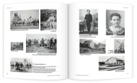
Overall I am very pleased with the project and delighted with the response readers have offered. A section of family photos and some genealogy graphics completed the work. My new friends at Asquith Press really helped make this project a delightful process with a very high quality book.


Tagged with: , , , ,

Power Vision Coaching and Consulting

PowerVision Coaching & Consulting is the web home for Athena Westlaken’s Career Coaching practice.

Summary HooPmedia created a custom web design and WordPress Theme, branded elements and new photography to set PowerVision Coaching and Consulting a notch above the competion. A review of existing tools and accounts led to a simplification of services.

Backstory A busy professional with plenty of distraction, Athena found managing her websites was turning into burden rather than a joy. She needed to update her brand and bring all her web projects together under one tool. It all seemed overwhelming.

Problem With her domain name up for renewal and the hosting company raising rates it was an ideal time to review the situation. The server based web template, used for editing the company pages, was easy to use but very restrictive in design options making it nearly impossible to create a strong brand statement. The blog had a completely different set of themes, tools and URL.

Outcome After a review of her content and service providers, we decided to simplify things. The brand, domain and all content (including the blog) were unified under the single branded Domain Name–PowerVison Coaching and Consulting. It was vital that editing be as easy and intuitive as possible. The writing tools in WordPress are familiar to MS Word or Apple Pages users. With a little bit of hand holding, Athena was up and running quickly.

Reflection PowerVision and Consulting was a really interesting project and presented an opportunity to hone custom web design and WordPress theme development skills. A custom plug-in was created to support custom colors and Call-To-Action buttons which further supports the brand, keeping the content professional and unique.

The colour palette was optimized for web by selecting trending colours from Pantone, and converting them to code. Orchid becomes #ae72ae and is easily defined in the WordPress editor with the shortcode [orchid].

By turning on sharing features, Athena is able to send her new articles to Twitter, Facebook and LinkedIN at scheduled times. While managing her own server is a bit challenging at times, sharing her stories and helping clients is more rewarding than ever. 

Short codes make it easy to add branded color to content.

[moss] Text to style green. [/moss]

– style the text branded green

[orchid] Text to style purple. [/orchid]

– style the text branded purple

[hr-moss]

– generate a stylized rule branded green

[btn-orchid] link [/btn-orchid]

– generate a stylized button branded purple

The Gallery below shows a few before and after comparisons as well the underlying Responsive Design of the site. Whether on a laptops, tablet or smartphone, PowerVision Coaching and Consulting is welcoming to all. (Click an image to start the slide presentation.)

Visit PowerVison Coaching and Consulting.

Tagged with: , , ,

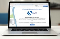
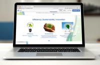
Australian Eco-Tech Solutions Landing Page

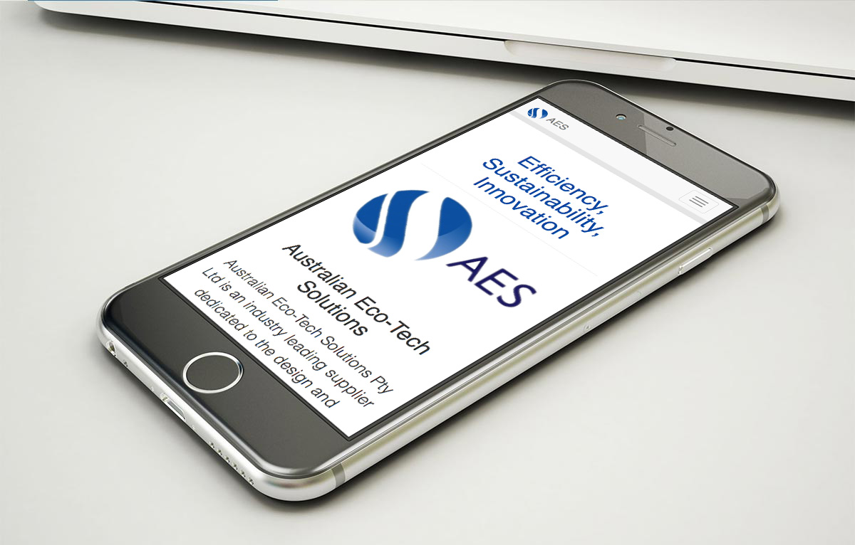
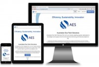
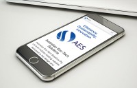
Mobile "Home" page for AET landing page

Australian industry leader of environmentally sustainable products, Australian Eco-Tech Solutions Pty Ltd, is dedicated to the design and supply of end to end solutions facility managers demand.

Collaborating with a busy Australian team from our base in Toronto, Canada was surprisingly easy. 12 hour time difference actually was a plus. While one side slept the other worked.

Summary:  To launch the new product line a landing page was required to help support supplier meetings, develop new markets and invite customers.

Backstory: Andrew Beveridge, a brillant entrepreneur with global connections in the education marketplace saw an opportunity to leverage his supplier relationships to expand his offering beyond the classroom. Energy saving LEDs and recycled plastic extrusions could be brought to market to bring cost and environment improvements to the entire education facility. Taking the project online at an early stage presented a distraction.

Problem:   With many aspects of the new venture still evolving the home on the web was languishing without direction.

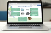
Solution: Recognizing that the principals of the company were traveling internationally, building relationships and opportunities on the ground, a simple landing page was proposed. To capture and collaborate on development, Google Apps were employed. Mock-ups were prepared as simple wireframes in Google Presentation and shared with the developers and client.

Google Docs collaborations screen AET site

Collaborating design across thousands of miles and nearly opposite time zones is surprising simple with the right tools. (Review the gallery below, click an image for a detailed slide show.)

Approvals: Screen layout preference was lightening fast to reveal. Editing copy was easy too. Google Apps provide clear commentary from all participants. Details were quickly sorted out and approvals in text beside each element and screen were clear. Production proceeded quickly and the site was ready in just a few weeks.

Outcome:  The landing page works great on mobile, tablet and desktop with simple “Call-To-Action”–Connect with us now. The page also presented product lines and the company story.

Reflection:  The simple landing page is doing its job. The company is growing rapidly and several other web projects are developing to support specific opportunities with relationship management and product catalog.

Google Apps–wireframe ideas to stimulate conversation, ideas and collaboration

The customer defined their basic needs for the landing page:

  • Web site is B2B and non public facing
  • After launch – minimal editing
  • Self managed content and server
  • Currently WordPress but open to anything easy to self manage
  • No IT department so require low-technology footprint
  • Online product catalog by late summer ‘15
  • Hundreds of products in 4-5 primary groups (3-4 sub groups each)
  • No e-commerce or customer logins expected
  • Low frequency editing

 Gallery of Screens

Tagged with: , ,

Toll-gate on the information highway

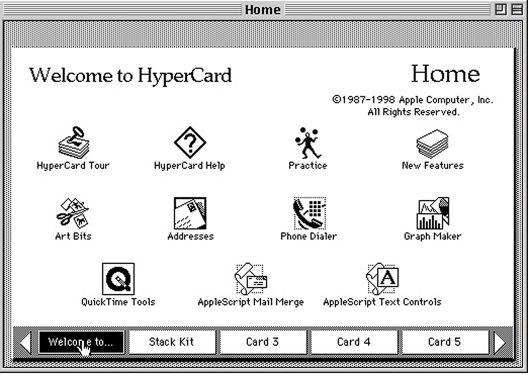
HyperCard-Home

Remember HyperCard?

Inspiration for the world wide web and the freedom of information!

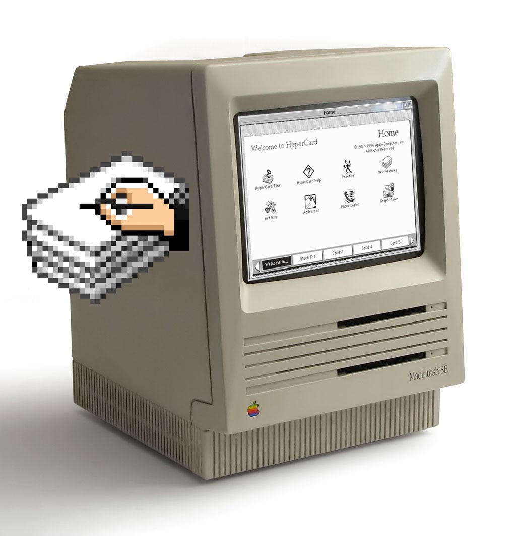
HyperCard shipped with the launch of the Macintosh SE in the spring of 1987. See the product shot I did for Apple Canada.  That combination of personal computer and programming tools was revolutionary– see this post!

This period was the earliest beginnings the interactive information age and we are fortunate that it happened as early as it did. A community of HyperCard developers quickly developed and began creating all sorts of wonderful interactive content including the original Myst. Read more ›

Tagged with: , , , , , , , , , ,

HyperCard

Mac SE with HyperCard

Before the World Wide Web did anything, HyperCard did everything.

On photography assignment for Apple Canada in 1987, I had opportunity to play with the new Macintosh SE and I never looked back. I was so empowered by Macintosh, HyperCard and their combined power that my life and career transformed forever. See the actual photo shoot here. Read more ›

Tagged with: , , , , , , , , ,

SNAC time: Branding with Content Management Systems

Part 5 of 5, SNAC time for your brand-Content

Getting your brand online requires coding your information so browsers can display it properly

Content Management Systems (CMS) are designed to help you write your web content without having to learn the code behind it. Additionally they will offer image library tools and suitable templates to speed your development. There are literally 100’s of quality CMS available for every type of business need.

Read more ›

Tagged with: ,

SNAC time Branding Internet Access

Part 4 of 5, SNAC time for your brand-Access

It should come as no surprise that in order to have an online brand you need an Internet Service Provider (ISP) to grant access to the Internet.

As a small business you may start out using a residential account to browse the web and edit your online presence. When it comes time to move into an office or hire staff a Business Internet account will come into play. Depending on how you initially set things up you may find yourself having to migrate email accounts, domain names and content. Read more ›

Tagged with: ,