
Designing and self publishing a book
Its funny how things turn out. I am first and foremost a photographer, a career which developed my sense of composition, design and story. As life carried me along, I found myself increasingly specifying design and managing communication projects. I had evolved/morphed into a Creative Director! Recently, I self-published a 460 page book that started out with no photography as all. Book publishing is demanding in many ways but new technologies are making it easier than ever before.
My father, an anthropologist, passed away, never finishing his epic family story. Asquith Press, part of the Toronto Reference Library’s Digital Innovation Hub helped me complete this very personal journey.
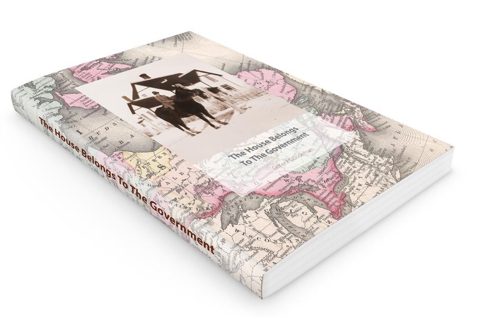
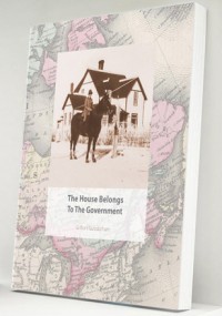
The House Belongs To The Government
G. Kent Gooderham
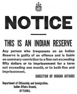
Ezekiel Gooderham was a brother of William Gooderham, co-founder of the Gooderham and Worts Distillery at York in 1832. This is his family story as retold through prose and verse. Ezekiel’s family continued westward as Canada grew, assisting the Cree and Blackfoot cope with life on reserve. Three generations of Gooderhams share their stories and reveal a personal portal into life on the Canadian prairie from 1879 through 1960.
The Book Machine.
The book design started out with no images whatsoever–460 pages of text! Designing a corporate brochure offers lots of visual elements that are fun to work with. This project would be an unexpectedly challenging project. Of course I understood the mechanics of offset printing and preparing creative for that process however the simplicity of “the book machine” (as Coach House poet bpNicol referred to the design problem), is surprisingly difficult to do well.
Typography would be an vital element. The history/genealogy laced prose also featured poetry. I was looking for a great font combination to help establish a clear hierarchy and structure. It also needed to be easy to read, compact–to keep the page count low, and complementary to Dad’s concrete style of poetry. I eventually settled on Myriad and Minion as these two typefaces are available in a wide variety of font weights to help with expression.
 Minion Pro was designed by Robert Slimbach in 1990. Robert also designed Myriad Pro with Carol Twombly, both typefaces for Adobe Systems. Myriad Pro is best known for its usage by Apple Inc., replacing Garamond as Apple’s corporate font since 2002. Those familiar with my work at Egan & TeamBoard will recognize Garamond as the logo font.
Overall I am very pleased with the project and delighted with the response readers have offered. A section of family photos and some genealogy graphics completed the work. My new friends at Asquith Press really helped make this project a delightful process with a very high quality book.
-

- First Edition–460 Pages
-

- The House with Gramma on horseback.
-
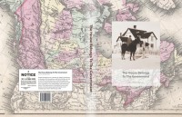
- Cover is a Colton Map of Canada 1857
-
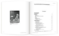
- Table of Contents
-
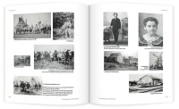
- Photo Gallery
-
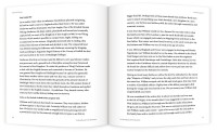
- Text pages
-

- Poetry pages
-
- The House Belongs To The Government-Proof Edition